How to Pick The Right Color For Your Kitchen Cabinets and Walls
Selecting the ideal color palette for kitchen cabinets and walls is a crucial decision that significantly impacts the overall aesthetic and functionality of the space. The kitchen, often considered the heart of the home, requires careful consideration of various factors to achieve a harmonious and visually appealing environment. Numerous elements influence the perception of color, including natural light, existing architectural features, personal preferences, and the desired mood. Therefore, a systematic approach incorporating these elements is essential for making informed color choices.
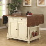
Color psychology plays a vital role in kitchen design. Different colors evoke distinct emotions and can influence appetite, energy levels, and overall feelings of well-being. Understanding these psychological effects can help one curate a kitchen that promotes a positive and welcoming atmosphere. Warm colors, such as reds, oranges, and yellows, are often associated with energy, warmth, and appetite stimulation. These colors can be effective in creating a vibrant and inviting kitchen atmosphere. Conversely, cool colors, like blues, greens, and purples, tend to evoke feelings of calmness, tranquility, and serenity. These colors can be beneficial for creating a relaxing and soothing kitchen environment. Neutral colors, such as whites, grays, and beiges, offer versatility and can be used to create a clean, sophisticated, or minimalist aesthetic.
The selection process should consider both the cabinet color and the wall color in tandem, ensuring they complement each other and create a cohesive design. A mismatch in color tones or saturation levels can lead to visual discord and an unappealing outcome. Understanding color theory, including concepts like complementary colors, analogous colors, and monochromatic schemes, is beneficial in achieving a balanced and harmonious color palette. Moreover, the finish of the cabinets and walls, whether matte, satin, semi-gloss, or gloss, will also influence how color is perceived and interacted with light.
Consider Existing Kitchen Elements and Architectural Style
Before diving into specific color choices, it is imperative to evaluate the existing elements and the architectural style of the kitchen. Countertops, flooring, backsplash materials, and appliance finishes all contribute to the overall color scheme and should be taken into account when selecting cabinet and wall colors. For instance, if the countertops feature a prominent granite pattern with earth tones, cabinet and wall colors that complement these tones, such as warm whites, creams, or soft beiges, would likely be a suitable choice. Similarly, if the flooring consists of a dark hardwood, lighter cabinet colors, such as whites, grays, or pastels, can provide a pleasing contrast. The backsplash material is particularly important as it is located in close proximity to both cabinets and walls. It is crucial to choose colors that harmonize with the backsplash to create a cohesive and unified aesthetic.
The architectural style of the kitchen is also a significant factor. A modern kitchen with sleek lines and minimalist design might benefit from a monochromatic color scheme or a combination of neutral colors with pops of bold accent colors. A traditional kitchen with ornate details and classic features might lend itself to warmer, richer colors, such as creams, browns, or even muted greens or blues. A farmhouse-style kitchen, known for its rustic charm, can incorporate natural wood tones, whites, and soft, muted colors to create a cozy and inviting atmosphere. Paying attention to the architectural style helps ensure that the color choices align with the overall design intent of the space.
Natural and artificial lighting play a pivotal role in how colors are perceived. Natural light tends to highlight the true colors of surfaces, while artificial light can alter colors depending on its temperature and intensity. Kitchens with ample natural light can often handle darker or more saturated colors, while kitchens with limited natural light may benefit from lighter and brighter colors to maximize illumination. It is recommended to test paint swatches in the kitchen under both natural and artificial lighting conditions to accurately assess how the colors will appear throughout the day and night. Incandescent lighting tends to cast a warm, yellowish hue, while LED lighting can range from warm to cool depending on its color temperature. Understanding the impact of different types of lighting is crucial for making informed color decisions.
Evaluate the Size and Layout of the Kitchen
The size and layout of the kitchen are critical considerations when selecting colors. Smaller kitchens generally benefit from lighter colors, which can create an illusion of spaciousness and openness. Darker colors in small kitchens can make the space feel cramped and enclosed. Therefore, whites, off-whites, light grays, and pale pastels are often recommended for smaller kitchens. Conversely, larger kitchens can handle darker or more saturated colors without feeling overwhelming. However, it is important to maintain a balance and avoid creating a space that feels too dark or oppressive. Combining lighter and darker colors strategically can add visual interest and depth to a larger kitchen.
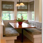
The layout of the kitchen also influences color choices. Open-concept kitchens, which are connected to other living spaces, require careful consideration of the color scheme to ensure it harmonizes with the adjacent areas. Choosing a color palette that flows seamlessly from the kitchen to the living room or dining room can create a sense of continuity and unity. In contrast, separate kitchens that are not connected to other living spaces offer more flexibility in terms of color choices. You can experiment with bolder or more contrasting colors without worrying about clashing with the surrounding areas.
The height of the ceilings is another factor to consider. Low ceilings can make a kitchen feel cramped, while high ceilings can create a sense of grandeur. To visually raise low ceilings, painting the cabinets and walls in lighter colors can help. Vertical stripes or patterns on the walls can also create the illusion of height. For kitchens with high ceilings, darker colors or crown molding can help to ground the space and prevent it from feeling too lofty.
Consider the functionality of the kitchen and how it is used. If the kitchen is primarily used for cooking and meal preparation, choosing colors that are easy to clean and maintain is essential. Lighter colors can show dirt and stains more readily, while darker colors can hide imperfections. However, very dark colors may require more frequent cleaning to prevent dust and smudges from being visible. Matte finishes tend to be less reflective and can hide imperfections better than glossy finishes. Semi-gloss or gloss finishes are more durable and easier to clean, but they can also highlight imperfections and reflect more light.
Consider Color Schemes and Undertones
Choosing the right color scheme is central to creating a cohesive and visually appealing kitchen. There are several color schemes to consider, each with its own unique characteristics and effects. A monochromatic color scheme involves using different shades and tints of a single color. This scheme can create a sense of harmony and simplicity, but it can also be monotonous if not executed correctly. Adding texture and varying the finishes can help to add depth and interest to a monochromatic kitchen.
An analogous color scheme involves using colors that are adjacent to each other on the color wheel. This scheme creates a sense of harmony and unity, as the colors share similar undertones. For example, a kitchen with blue cabinets, green walls, and turquoise accents would be considered an analogous color scheme. This scheme is generally easy to implement and can create a soothing and inviting atmosphere.
A complementary color scheme involves using colors that are opposite each other on the color wheel. This scheme creates a sense of contrast and energy, as the colors stand out against each other. For example, a kitchen with blue cabinets and orange walls would be considered a complementary color scheme. This scheme can be visually striking, but it is important to use the colors in moderation to avoid creating a jarring or overwhelming effect.
It is crucial to understand the undertones of colors. Undertones are subtle hues that lie beneath the surface color and can significantly impact how the color is perceived. Warm colors have yellow, orange, or red undertones, while cool colors have blue, green, or purple undertones. Neutral colors can also have warm or cool undertones. Choosing colors with similar undertones is essential for creating a harmonious color palette. For example, if the cabinets have a warm undertone, choosing wall colors with warm undertones will create a more cohesive look. Conversely, mixing colors with conflicting undertones can lead to a mismatched and unappealing result.
Testing paint samples is an indispensable step in the color selection process. Paint colors can look different in the store compared to how they appear in the kitchen. Lighting conditions, the surrounding colors, and the texture of the surfaces can all influence how the color is perceived. It is recommended to purchase small samples of several different paint colors and apply them to different areas of the kitchen, including the cabinets and walls. Observe the colors under different lighting conditions throughout the day and night. Pay attention to how the colors interact with the existing elements in the kitchen, such as the countertops, flooring, and backsplash. This step will help to narrow down the choices and ensure that the final color selection is well-informed and satisfactory.
Ultimately, the best color choices for kitchen cabinets and walls will depend on individual preferences and the overall design goals. However, by considering the factors discussed in this analysis, one can make informed decisions that result in a beautiful, functional, and inviting kitchen space. The key is to be thoughtful, methodical, and to take the time to experiment and evaluate different options before committing to a final color scheme.

How To Choose The Right Paint Color For Your Kitchen Paintzen

How To Choose A Kitchen Cabinet Color According Designers

How To Choose A Kitchen Cabinet Color According Designers

How Do You Match Your Wall Color Kitchen Cabinets

How To Choose Color Schemes For Your Kitchen Remodel Kraftmaid

Choosing The Best Paint Colors For A Kitchen With Dark Cabinets Five Star Painting

70 Top Kitchen Paint Colors Best 2024

How To Choose Kitchen Cabinet Paint Colors

How Do You Match Your Wall Color Kitchen Cabinets

How To Choose Kitchen Cabinet Paint Colors
Related Posts